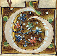
There is a particular type of cut-out illuminated foliate initial which is found in many institutions, and of which examples appear on the market with some regularity. Once you have seen a few they are very easy to recognise, because although one may differ from another in their type of foliage, their formal and technical features are very consistent. The image above has been chosen to give a sense of their overall uniformity as well as variety of foliage-types (click the image to enlarge). Over the course of a couple of posts I intend to look at this large group of initials (I know of more than 200 of them [1]), and consider some questions they raise.
In 1994 Christopher de Hamel suggested that the initials came from the same manuscript as the well-known historiated initials cut from the Murano Gradual; he based this partly on details of their illuminated ornament, but mainly on the script of the text and music on their backs[2], and since then, they have regularly been described as having come from the Murano Gradual. The question of the parent volume has been addressed very recently. In 2019 Bryan C. Keene and Stephanie Azzarello offered some observations both for and against accepting de Hamel's proposal, but left the question open: 'further analysis of this entire group of illuminations is in order and will be part of a longer study'. In a recent article, having had the opportunity for further analysis, they concluded that "[the initials'] association with the Murano manuscripts does not seem likely", and pointing to evidence that "aids in disassociating De Hamel’s group of initials from the Murano series".
Photographs can be very deceptive in this matter, but one of the most striking features of the initials is their highly-burnished gold ground, as seen in this example:
The image above perhaps exaggerates this feature, while the next one (chosen partly to convey a sense of scale) disguises it:
If we compare the ones above with a few others, we can see some formal features that recur again and again:The gold ground is framed by a black line, that may be fairly straight but often curves in slightly towards the initials at the sides, often interrupted by a small cusp or notch, or an outward 'step' to accommodate the shape of the initial, and may sometimes have an irregular outline to avoid overlapping the adjacent text or musical notation.
The letter itself is in one of a few colours, usually blue or a sort of pale pinkish buff (but occasionally orange, or grey), modelled with leafy forms in white:
In most examples there are simple leaf-forms, half green and half yellow-green, to each side of the initial and at its extemities (in the image above, only the "I" in the middle lacks them).The floral/foliage forms vary considerably, but harmonise through a consistent palette, manner of highlighting in white, and a relatively small number of formal structures; the leaves or flowers often branch off from two twisting stems, for example, as in the two initials in the lower right corner of the image above, and these two:
I trust that the reader now has a good feeling for what these initials look like, but I give one more example to demonstrate that, even when the interior of the initial is very unusual (as when the initial incorprates a human or animal), the family resemblance is still unmistakable:
We can now turn to asessing their potential relationship with the Murano Gradual.
It seems to me that there are several features that can be compared and contrasted between the small illuminated initials shown above, and the larger cuttings with historiated initials, including the script (both its form, and its use of abbreviations etc.) including the rubrics, the musical notation, the mise-en-page (especially the ruling for text and staves), and the illumination.
I do not know enough about music to have a confident opinion, but to my eye the notation on the back of the small initials and on the larger historiated initials looks the same, but comparison is hampered by the small portions that survive on the backs of the cuttings.
I am confident, however, that the text on the back of the small initials is probably by the same scribe as that of the large initials; I cannot see any significant differences, and they share features such as the unusually long hairline stroke on the letter "e":
 |
| [Small foliate initial] |
I will leave the question of dimensions for a subsequent post because it is a tricky issue, for reasons that deserves broader discussion. But to pre-empt that post slightly, one problem in the present case is that students (including me) usually measure the rastrum (the height of the musical stave) rather than the space between the staves, and I have no measurements for a full stave on the back of a small decorated initial: typically they preserve only the bottom of one stave, some text, and maybe the top of the next stave, but not a whole stave, as in these examples:
 |
| Getty Museum |
 |
| Musée Cluny |
 |
| British Library |
EDIT, 13 March 2022: I have now added a list of the initials known to me on a page here; I welcome additions, corrections, etc.
Added, 7 March 2022:-- 4 formerly at Bloomsbury Auctions, 8 July 2015, lot 78 (the three cited by Azzarello & Keene without a lot number were lot 77)-- 8 more at the Art Institute Chicago-- 2 at the Art Museum, Princeton


No comments:
Post a Comment
** PLEASE INCLUDE YOUR NAME IN YOUR COMMENT **
I may ignore and delete anonymous comments